The evolution of the Web has brought each time more tools and solutions for an elaborate development of Websites. Skillful technics created by Web developers to produce the layout, aiming to achieve the desired result typographic, are already being obsolete due to the implementation of new resources. The main one, Web Fonts – native support for the use of external sources – expands the use of typefaces in addition to the already known Web Safe Fonts. The Web Fonts have become a core component to the layout of the new generations of Websites and give the designer the choice interface for a proper design to typographic selection, leaving aside the important premise to meet the basic requirements, including, readability and readability, keeping in mind the various access platforms and target audience. This responsibility requires that the interface designer to continue to improve their typographic studies and master it is technical resources in the digital environment. This work is focused on typography as the primordial communication element, its historical context and evolution of the digital means to the Web environment, analyzing the new technical improvements and the visual impact generated for the user who uses the Web applications in their daily lives. It dialogue directly with the designer interface, showing how your choice needs to be refined and followed by precepts already studied before and making way for a new use of digital typography.
THANKS
I want to thank all the people who participated directly or indirectly of this work, devoting some of their time, helping to make it possible.
Em um mundo repleto de mensagens que ninguém pediu para receber, a tipografia precisa freqüentemente chamar a atenção para si própria antes de ser lida. Para que ela seja lida, precisa contudo abdicar da mesma atenção que despertou. A tipografia que tem algo a dizer aspira, portanto, a ser uma espécie de estátua transparente. (BRINGHURST, 2005, p.23).
1 INTRODUCTION
Since it’s beginnings, the Web has used one of the oldest forms of communication: 95% of all it’s information is made up of written language. Thus, an interface designer should have knowledge and control of the fundamental element of layout, the typography. (REICHENSTEIN, 2006b).
Web Font is a generic term used to make reference to the use of external fonts. To establish a connection between web pages and Web Fonts, it is necessary to use the rule “@font-face”, that returns as strong candidate to W3C (World Wide Web Consortium) approval, to be a CSS level 3 development standard. This allows Interface Designers to freely choose any typography font. According to data from the website HTTP ARCHIVE site (2013), between November 2010 and November 2013, Web Fonts usage increased from 1% to 35%, indicating that it’s acceptance, even before the mentioned approval, is a signal that developers were anxious for an efficient and effective solution for the use of text on the Web.
The new feature not just brings ease to developers, but also, technical and visual benefits: optimized compression, better performance, indexing, translation, rendering, high DPI (dots per inch – English term used to measure the dots quantity existing in a inch, on surface where the image is displayed), among other things. (GRIGORIK, 2012). However, that new feature brings with it new questions. This whole benefit can’t be valuable if: (a) the user has difficulties to read texts where the chosen typographic family is projected to high resolution monitors and not for low size mobile devices; (b) the font size used is too small; (c) the leadings are reduced and spacement is too short, etc.
To enjoy the benefits and solve all cited problems, the Interface Designer must dominate the typography, it’s concepts and features related to the way it was projected. Your projects now have more resources for innovations, however, they can’t leave aside the need for a harmonic typographic usage, good readability (ease where the eye crosses the text, absorving information) and legibility (ease of distinction of an character to another), delivering a better experience.
The new scenario is made of benefits, where designers shall keep your continuous improvement and make closer your relation with developers, responsible for implant the resources, making themselves big allied in interface development for a better application and typographic usage.
This work has as objective, help designers to improve themselves and introduce the typographic world to developers. The text introduces itself divided in four parts: first one is a brief explanation of the most used terms; second, a bibliographic compendium about the typography history, introducing it’s journey to the Web; the third explores these new resources and possibilities made possible by Web Fonts; the last proposes to the designer a reflection of it’s responsibility for an appropriate typography usage and it’s relation with the latest technologies.
2 TERMINOLOGIES
2.1 WEB
The Internet is a global network of computer networks, allowing thousands of computers to communicate with each other when connected through it, using the TCP/IP protocol. (FERREIRA, 2011).
The World Wide Web (WWW) or simply the Web, is the network that connects hypertext documents created following standard syntax, being HTML for the structure of content and CSS to control the appearance of HTML documents. The transfer through the network is made by means of the HTTP protocol, and each document is identified by a unique address called a URL. It uses a software called navigator/browser to access, view and interact with documents on the Web. (FERREIRA, 2011).
2.2 TYPOGRAPHY
The etymological origin of the term refers to the printing press with movable type, originated in the 15th century Europe. At present it has a broad meaning, including demonstrations of experimental character, photoletter, posters, digital fonts, etc, as well disentailing of metal movable type. Priscila Farias (2013) defines typography as:
[…] o conjunto de práticas subjacentes à criação e à utilização de símbolos visíveis relacionados aos caracteres ortográficos (letras) e paraortográficos (tais como números e sinais de pontuação), para fins de reprodução, independentemente do modo como foram criados (a mão livre, por meios mecânicos) ou reproduzidos (impressos em papel, gravados em documento digital). (Priscila Farias, 2013, p. 18).
With the evolution of the graphical design studies, the typography becomes one of the foci of study and passes being one of the sections of the area, resulting in the term typographical design, to differentiate works in which the typography is the most important element. Due to the link with the passed, some terms originating from mobile typography are still part of the typographical terminology, like “typographical font”, derived from the lating fundere (fund). It refers to one of the styles belonging to a family of typographical characters, having the synonym “typographical family”. (FARIAS, 2013).
In a digital environment, digital fonts or computer fonts are digital files composed by a set of characters (each one of letters, numbers and signs that compose a typographical font) and glyphs (a particular form given to each character, in that a character can have more than one glyph) for the rendering of text. (MANIAN, 2009).
In the web environment, a new typographical term gets the form: Web Font, a generic term to make a reference to the use of external fonts, in HTML pages formatted with CSS by meand of the resource “@font-face”. (FERREIRA, 2011).
3 CONTEXT AND TYPOGRAPHICAL HISTORY
3.1 THE ORIGINS OF TYPOGRAPHY WITH MANUAL COMPOSITION
As pointed out by Claudio Rocha (2005), the cultural progression of humanity occurs in cycles on the axes of power and knowledge, and this is directly reflected in typography. Since its beginning, it is and was driven by technical issues, as seen in the formation of close relationships with aspects of aesthetics and economics. This can be seen beginning with the appearance of the metal moving type.
Writing spread throughout the world, multiplying itself in diverse alphabets and adapting itself to new environments. The biggest driving force for this dissemination was printing with moving type. Credited to Johannes Gutenberg, the invention of moving type dates to the beginning of the 15th century in Germany. (ROCHA, 2005). Before that, it had been attempted without success in China, due to the large quantity of characters in written Chinese. Moving type adapted well to the Latin alphabet, as in this writing system: in this alphabet, the amount of characters is reduced to a few letters representing speech sounds, and are thus better suited to mechanization. (LUPTON, 2006).
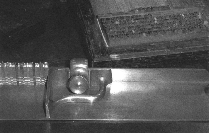
The process of manual composition was the only one until the end of the 19th century. It used metal types cast from a matrix with the image of a character in low relief, which, in turn, was formed by another matrix in high relief called a punch (Figure 1). The reversed types in high relief were organized on a composing stick (Figure 2), forming lines of text with pre-adjusted widths. In turn, the latter were arranged on a tray called a type galley (Figure 2), and from there were sent to the printing press to be printed. After printing, the types were reordered in a drawer for later usage. (ROCHA, 2005).
Figure 1 – Punch, Matrix and Letterpress
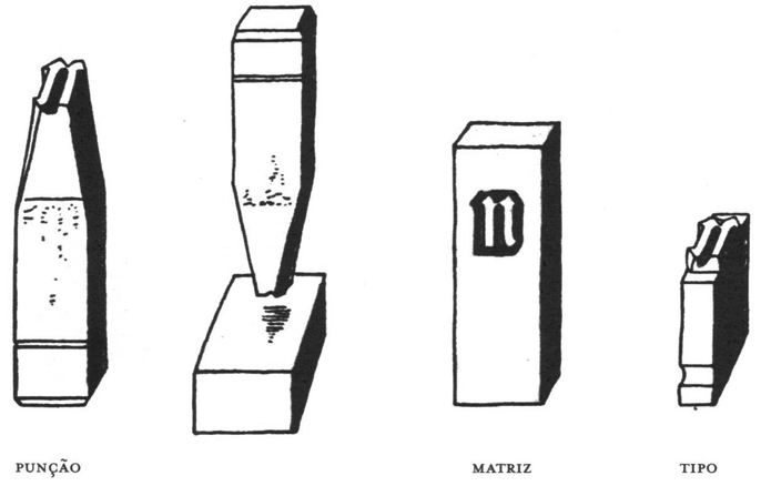
Figure 2 – Composing stick and type galley
In 1884, a German named Ottmar Mergenthaler produced a mechanical system called “Linotype” which cast and arranged the types. Equipped with a keyboard, a magazine with type matrices and a coupled smelter, its operation was likened to that of a typewriter: upon pressing a key, a matrix of the corresponding character was released, and so on until a line was completed. This line went mechanically to the smelter, which fused and ejected each line at a time. The matrixes were already returned to the magazine and redistributed in their respective compartments. This kind of composition increased productivity up to six times. (ROCHA, 2005).
3.2 Cold Typesetting
In 1947, typography put aside the mechanical process and was adapted to photographic processing, which was incredibly faster. In principle, the phototypesetting system was formed by the matrix of characters in negative images processed photographically onto light-sensitive material. However, that system had a big limitation: the magnification of characters. From there on, photocomposition and transfer lettering began to appear, called “Letraset”. (ROCHA, 2005).
3.3 THE DIGITAL REVOLUTION
With the emergence of the first computers, typography was automatically assimilated by those means. The types left the physical support and became binary codes. A typographic font has turned into a digital archive encoded with the descriptions for its visualization on screen (surface responsible for image projection by digital means) and printing output. Those encodings are interpreted directly by the operating system. (ROCHA, 2005).
This digital revolution has broke barriers and spread rapidly. The typographer, that earlier was responsible for the whole printing process and for the creation of movable type, specialized himself, to have command of new technologies for the creation of digital fonts. The Digital typography has surprisingly improved the quality of printed typography due to the more accurate adjustments.
3.4 MIGRATION TO THE WEB ENVIRONMENT
3.4.1 Beginning of the Web Typography
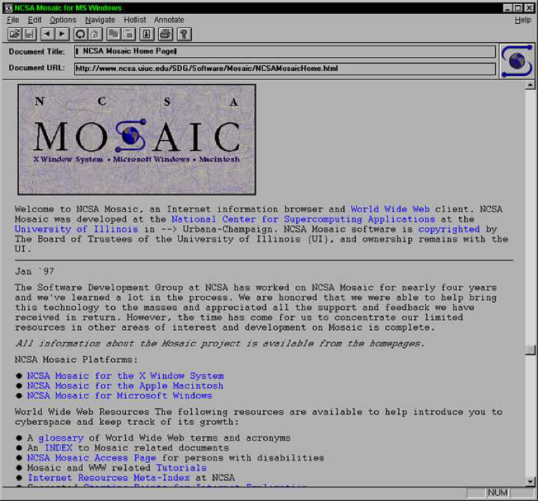
With the web, once again the typography has reached new levels, expanding considerably. Due to the easiness to produce a digital font, the quantity of fonts has multiplied rapidly. In 1993, the Web was driven with the appearance of the first graphical navigator, the NCSA Mosaic (Figure 3), capable of showing images and text in the same screen. For the designers, then a new challenge arose: the creation of layouts for this new environment. However, this new group of navigators used to have the limitation of giving support for an unique font family as standard, necessarily installed in the operating system. (VEEN, 2011).
In this time the HTML was not used to have any specification for the control of its fonts and styles, these were being controlled directly by the browsers. It was only in 1995 that Netscape introduced the tag “<font>”, just standardized in version 2 of HTML. This tag specified a font being used in the rendering of a text, must be installed previously on the computer of the user.
O uso da HTML não dá aos designers de sites um ambiente para a manipulação direta bidimensional. Em lugar disto, fazer o design de um site da Web é como trabalhar com algo disforme. Logo que passamos a outra pessoa, adota uma outra configuração. (SIEGEL, 1999, p. 65).
Figure 3 – Interface of NCSA Mosaic 1.0
Siegel (1999) already showed dissatisfaction with such typographical limitations and therefore raised the matter of the great challenge to develop a website with a good typography, making it clear that a good typographical result used to be nearly impossible. He also showed the necessity of using the adaptations and tricks to produce nice webpages. Subsequently the tag “<font>”, was discontinued in the HTML specifications, promoting the separation of the HTML content and the styling with the CSS. (FERREIRA, 2011).
The first CSS specification, launched in 1996, definitely removed tags rather exclusive for the HTML styling. Thus, what before used to be treated by the “<font>” tag passed to become part of the CSS and received the following properties: “font-family” (typographical family), “font-style” (italic or normal style), “font-variant” (apllies small caps in the text), “font-weight” (weight) and “font-size” (size). (SIEGEL, 1999).
3.4.2 Fallback Fonts and Generic Font Families
With the CSS attribute “font-family”, it is allowed to use multiple fonts. These fonts are listed, for example, in the following way:
font-family: Helvetica, “Lucida Sans”, Arial;
The first one is the principle one. If the user does not have the features in his machine, automatically the browser will fetch the next from the list, and likewise succesively. That font – chosen for substitution – is called the Fallback Font. In case none of those is found, the browser will show the text with its standard font. The same process occurs when the browser finds a character that is not supported in the character set of the actual font.
Content, used not to have the guarantee that the desired fonts would be installed in the operatifn system of the user, therefore, there used to be the risk that the web design should be displayed in “Arial” were to be displayed in “Times” (typefaces of a completely different design, one serif and the other one sans-serif). To settle that problem a bit, the CSS allowed the utilisation of a generic typographical familiy, declared after all the Fallback Fonts. Example:
font-family: Helvetica, “Lucida Sans”, Arial, sans-serif;
Such families are divided according to the visual characteristics of each on e of them. They are:
- Sans-serif – Fonts that do not have serifs in the decoration;
- Serif – Fonts that present serifs;
- Monospace – Fonts in which all characters the same width, independent of having serifs or not;
- Cursive – Fonts that mimic the cursive writing;
- Fantasy – Fonts that have symbols, icons or decorative characters;
3.4.3 Web Safe Fonts
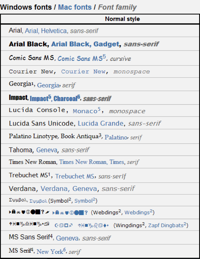
Over time, the navigators (browsers) past the support from one unique font to a quantity of eighteen in 2008. As it used not to be possible to guarantee the the user would have a certain font, the manufacturers of operatins systems intervened with the purpose to facilitate the development of Websites, creating the Web Safe Fonts (Figure 4). Microsoft launched the project Core Fonts for the Web, initiated in 1996 and finalized in 2002 (MICROSOFT, 2002). The project consisted of a package of standard fonts for the Web, distributed for free, with some limitations of use, reaching a high number of users. Since then fonts like “Arial”, “Georgia” and “Verdana” have become standards for the Web.
By becoming pre-installed in the versions of the operating systems after launching this package, the Web Safe Fonts could be used with safety, it is referring to the proper “font-family” of the CSS. Compared to the quantity of fonts in use by the printer, this still used to be a barrier to overcome by the typography on the Web. (VEEN, 2011).
Figure 4 – Set of the Web Safe Fonts
3.4.4 Alternative Solutions: text as image, object or script.
Due to the search of designers to be able to use fonts of their choice in Websites, several solutions were being implemented. Even programmers picked up alternative solutions to utilize fonts directly in the browsers. These searches have driven the evolution of the typography for the Web. Between all the attempts, three solutions were widely used. They are:
The use of text as image – A solution simple and more practical, consists of the substitution of the HTML text by an image containing the same text, though using a non Web Safe font. The positive aspect is that this solution makes it possible to use any font in a Website. The negative aspects, on the other side, are the fact that it blocks the selection of text, increases the use of the bandwidth, it is bad for services of optimazation of research, it is not translatable, generates a degradation of the image in higher resolution and it becomes it becomes inaccessible for whom are using assitance devices. Subsequently, CSS techniques have refined its use, applying the image on top of the HTML text of the page. This eliminates the problems of accessibility and makes the text searchable. (VEEN, 2011).
Text embedded as object (Flash) – The solution is similar to the use of text as image but, this time, it is utilized as a vector file of the Flash software as substitution, with the tag “<object>”. This file was embedded in HTML and the text was rendered as vector. This solution was showing the text better and was not having the problem of undergoing degradation through pictures in high resolution, besides allowing the selection of the text. Its use, however, required a plugin installed on the machine of the client for showing the file. There is still the fact of the resignation of the Apple company to support the format on their devices with the iOS platform, making that users of iPads, iPods and iPhones did not have access to the text with this resouce. (VEEN, 2011).
Rendering of the text by JavaScript – Another implemented solution was the use of scripts in the JavaScript language, that substitute the text by VML – Vector Markup Language (for Internet Explorer) or SVG – Scalable Vector Graphics (for other browsers). These scripts automated the rendering of the text, although, it is not selectable or resizable, and its use for large amounts of text can lead to a bad performance. (VEEN, 2011).
None of the presented solutions was suficiently effective for applicaton in extended blocks of text, working best in short sentences and in titles. Still it has become each time more common in a web development, and this requirement for utilization of fonts besides of the Web Safe Fonts brought the necessity of a standardization with a more adequate solution. (FERREIRA, 2011).
3.4.5 Web Fonts and the @font-face
In 1998 the specification of CCS2 was released. It has the objective to bring improvements for the use of the typography on the Web and was promoting a move forward till then hardly explored. The new specifications have added the rule “@font-face”, that enabled the download of the external font from the Website, making the use of non-preinstalled fonts possible for viewing of the pages. Technically, the rule only makes a link to the file of the font, however, the browser requires to make the download of that file for viewing. In spite of the evolution that this would bring, these new techniques have not had much use in the era and were removed from the specifications of CSS2.1. (MANIAN, 2009).
Greg Veen (2011) attributes to the tireless battle between the browsers in the 90s, or it is, between Internet Explorer and Netscape – with their inconsistent implementations -, one of the reasons for the delay in the use of Web Fonts. Only one decade later, with the drafts of CSS3, the interest for the use of external fonts returned, and again the rule “@font-face” came into effect, treading in this way the typographical move forward so waited for.
In contrast to the official specifications, since its version 4.0, launched in 1997, the browser Internet Explorer has support the native to the “@font-face”. Microsoft implemeted a new fornt format called EOT, existing till the version 8,0 of the browser. Since 2007, one by one, the major graphical browsers started to offer support to the former rule (including browsers for mobile devices) utilizing various formats – the already standard desktop fonts TrueType and OpenType, besides of SVG and WOFF (Web Open Font Format – format that combines technologies of the TrueType and OpenType files, format accepted as standard for the Web Fonts) – and ignoring the EOT of Microsoft. (MANIAN, 2009).
The utilization of a Web Font is simple, sufficing just making a link to the font file which it intends to make use of. In certain cases, the developer can prefer to use the font locally installed on the machine of the user and only make the download when these fonts are not being available. This is possible utilizing “(“local()” in the definition of the file path in the rule “@font-face”. The browser is in charge to make this verification and load only one font. (DAGGETT, 2009).
See the example of usage the following:
    @font-face {
        font-family: Helvetica;
        src: local("Helvetica Neue"),
        url(MinhaHelvetica.ttf);
    }
For Fink (2010), this support was an indispensable piece that was missing in the Web since its appearance, having forms like this is an emergent typographical scenario, dictating a new way, with new possibilities.
4 TYPOGRAPHIC POTENTIALIZATION WITH THE ARRIVAL OF WEB FONTS
4.1 DIGITAL RENDERING OF A FONT
One of the important factors in favor of the use of Web Fonts is that they look much better on the screen. But this is still a factor dependent on browser technologies, operating systems and devices, which creates a challenge in choosing a good Web Font. In order to understand a bit of this problem, we need to know how the digital medium renders the font.
A digital font is a vector file that can be scaled without losing the quality. Its rendering on screen is based on grids of pixels, related to the resolution of the monitors or devices on which they will be shown. That rendering is also affected by interference from operating systems and browsers. That is why a font can be displayed in the same browser with different operating systems in diverse ways, offering better legibility in one than in another. In the following image (Figure 5). the letter “O” appears in a pixel grid, which shows how that rendering is done on a digital screen. In the grid, the pixels can appear as on (with color) or off (without color). According to the size of the font, the operating system calls the pixels that better represent the depiction of the form. However, the system does not always do that in the best way. Observing the image, we see that the representation of the right side is more faithful to the design of the letter “O”, preserving the similarities between the two sides of the character. That is only possible thanks thanks to hinting instructions, which are programmed by the type designer before generating the font file. It is those instructions which guarantee that a glyph retains the appropriate proportions, thus drastically improving the legibility of texts in small sizes and out-of-date browsers. (VEEN, 2011). The hinting comes from being used since the decade of the 80’s, before even of the Web, to improve the rendering in low resolution printers. For Nick Sherman (2013), hinting is to fonts what responsive design is to websites.
Figure 5 – Pixel grid representing the letter “O”
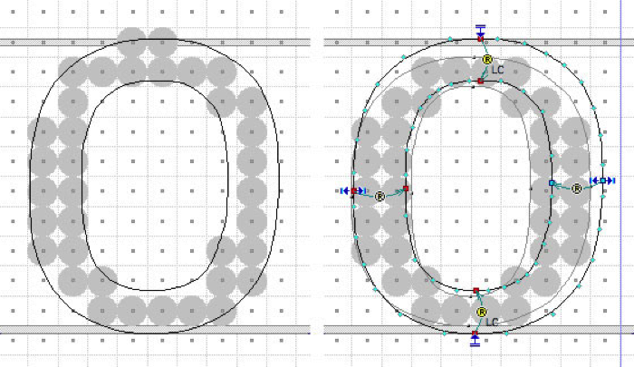
The fact that the font performs differently in various browsers means that the designer of the interface had to worry about choosing the ideal Web Font at the beginning of the process. It is necessary to pay attention to the fact that fonts for print don’t always render well on screen, since they don’t have hinting instructions. (VEEN, 2011). Hinting development work is difficult, tedious, lengthy, and expensive. Some automation tools make the work easier, but for small bodies of text, it’s still more appropriate to do manual work. Sherman (2013) expresses the desire of developers to make this concern obsolete with the evolution of screens and rendering software in the future.
The idea of “modifying” characters in different situations is nothing new. Gutenburg was already using optical adjustments for different text sizes (Figure 6), altering spacing, proportion, width and other details to optimize printing. In the same vein, there are already situations where developers detect the conditions for use and provide a specific font for the context. This is another great possibility for typography usage on the Web. (SHERMAN, 2013).
Figure 6 – Comparison of sizes of the letter “a”

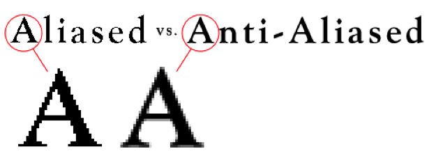
In rendering, another resource besides hinting is needed. It is for the anti-aliasing to the smoothing of the curves (Figure 7), a process that basically consists of adding semi-transparent pixels on the edges of characters, avoiding aliasing. The efficiency of anti-aliasing depends on hinting and also on softwares and operating systems, and together they are of utmost importance to make the text readable. (GIANNATTASIO, 2009).
Figure 7 – Anti-aliasing comparison
Anteriormente não existia nenhum controle de como a fonte seria renderizada na Web para o usuário. Com os estudos do CCS3, duas novas possibilidades dão certo controle na entrega do texto em HTML: o já citado “@font-face” e a nova propriedade “font-smooth”.
Tom Giannattasio (2009) defende que, com o “@font-face”, podemos criar um mundo visualmente mais atraente da tipografia na Web, eliminando o uso de fontes locais de baixa qualidade ou fontes feitas para impressão, péssimas para visualização em tela – principalmente em pequenos textos –, e entregando fontes com melhor controle de hinting e mais legíveis. Já a propriedade “font-smooth”, ainda obscura no meio dos desenvolvedores, permite controlar quando a suavização é usada, mas não como, o que é feito pelo sistema do usuário. Ainda não é suportado completamente em todos os maiores navegadores; quando implementado, proverá a capacidade de desabilitar o anti-aliasing, uma boa solução em textos de tamanhos pequenos.
See an example, with its possible values:
font-smooth: auto | never | always | <absolute-size> | length
Cada navegador depende do sistema operacional com sua tecnologia própria para a renderização da fonte. Infelizmente eles podem estar sujeitos a problemas de compatibilidade com os sistemas e renderizarem de forma problemática. Sobre esses aspectos, os designers de interface não possuem controle. According to Tom Giannattasio (2009), the ideal is to understand the nuances of every browser and adapt to every platform.
4.2 STYLISTIC SIMILARITIES AMONG TEXTS IN DIFFERENT LANGUAGES
Seguindo o caminho trilhado hoje pela Web, a tipografia digital vem há algum tempo seguindo padronizações. Por volta de 1987, começaram os estudos para que os computadores pudessem interpretar corretamente caracteres de qualquer tipo de escrita de forma consistente. (UNICODE, 2014).
Esse padrão já é comum em fontes digitais para desktop, e as Web Fonts também o seguem. Ele é tratado internamente pelos sistemas operacionais, porém deve ser corretamente implementado pelos designers de tipos na montagem do arquivo de fonte.
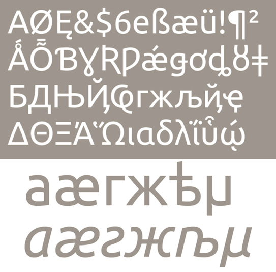
O uso das Web Fonts dá ao designer de interface a possibilidade de manter a similaridade visual de textos com idiomas diferentes, principalmente os não latinos como árabe e japonês, entre outros. Línguas menores e escritas antigas também sofrem com a falta de fontes com suporte adequado. (DAGGETT, 2009). The following image (Figure 8) shows the same font family with similar characteristics in the characters from alphabets like Greek or Cyrillic, preserving proportions of width and height in each one.
Figure 8 – Ubuntu Typeface
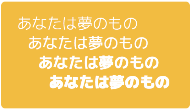
O uso de uma Web Font não é necessário somente para suporte de determinado idioma. Muitas vezes é preciso usar pesos ou estilos diferentes no texto (Figura 9), aplicando um negrito ou um itálico, e nem sempre famílias tipográficas possuem mais de um peso. (DAGGETT, 2009).
Figure 9 – M+ font family
A respeito desse uso de negritos e itálicos, uma nova funcionalidade é aguardada. Quando se declara que o texto será negrito ou itálico, e a família da fonte não possui esse peso ou estilo, o navegador irá forçar de alguma forma criando os pesos desejados, resultando assim em uma distorção da tipografia, o que pode ocasionar resultados ruins. Devido a cada implementação de navegador, a renderização de um negrito pode ser mais forte em um e suave em outro. Para controlar essa situação, o CSS3 possui a propriedade “font-synthesis”, que controla se essa distorção pode ou não ser feita pelo navegador. (STEARNS, 2012).
Na figura 10, a fonte “Lora” primeiramente é forçada a ser renderizada em negrito e itálico com as tags “<strong>” e “<cite>” respectivamente. O resultado não é tão ruim, porém o negrito não possui um bom contraste com o resto do texto, e o itálico parece um pouco inclinado demais. Na segunda frase, negrito e itálico são parte da família tipográfica, muito mais condizentes visualmente com o texto.
Figura 10 – Comparison of true and forced bold and italic

4.3 OPENTYPE AND YOUR FEATURES
OpenType is the most recent and modern format for digital fonts. Its benefits include compatibility between platforms, thorough support and a set of characters based on the Unicode pattern. Thanks to OpenType, characters from many different languages can be fitted into one font, supporting more than 65 thousand types and simplifying the multi-language text process. It also counts on resources that prompt a rich linguistic support and an advanced typographical control. (FONTSHOP INTERNATIONAL, 2012).
A single font file may contain many non-standard glyphs, such as old-style figures, tabular figures, small capitals, fractions, swashes, superiors, inferiors, titling letters, contextual and stylistic alternates, a full range of ligatures, symbols and ornaments. The OpenType layout features allow automatic positioning or substitution of glyphs. (FONTSHOP INTERNATIONAL, 2012)
With web browser’s ability to display OpenType fonts, some have also started giving support to resources present in the format. That will be controlled using CSS and a “@font-face” rule, holding its release until the W3C (World Wide Web Constortium, 2014).
Some of such resources are:
Small caps – It turns lower case letters into capitals, keeping the lower case’s height.
Figure 11 – Small caps example

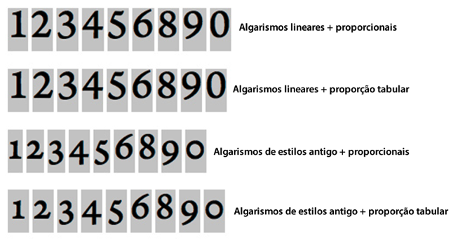
Set of figures – The set of figures contains the aligned numerals (numerals that follow the same baselines and height) and the numerals of an old style (numerals that have descenders and ascenders, that are better used in quick text)(Figure 12), follow the tabular proportion (numbers that have the same width) or the proportional (Figure 13). (HERRMANN, 2010).
Figure 12 – Examples of numerals of an old style

Figure 13 – Set of figures
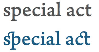
Ligaturas – Junção de letras (Figura 14), que podem ter um propósito estilístico ou histórico. (HERRMANN, 2010).
Figure 14 – Ligature examples
Contextual alternates – the ligatures are optional, however, in some cases, depending on the font (Figure 15) or language, it is necessary that the character has substitution according to it’s proportion to or the following character. (HERRMAN, 2010).
Figure 15 – Contextual alternate examples

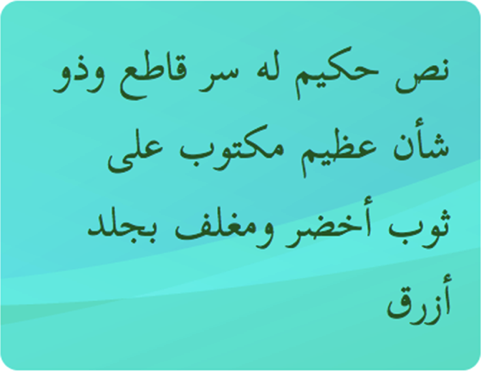
Línguas como o árabe requerem essa substituição para sua escrita, processo em que o caractere é completamente afetado pelos caracteres ao redor (Figura 16). (DAGGETT, 2009).
Figure 16 – Arabic writing example
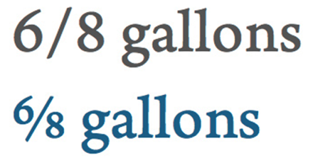
Frações – Um set de caracteres básico em toda fonte possui as frações 1⁄4, 1⁄2 e 3⁄4. Com o OpenType porém é possível a criação de quantas frações forem necessárias (Figura 17). (HERRMANN, 2010).
Figure 17 – Example of fractions
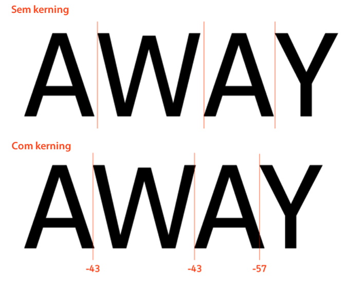
Kerning – Ajuste de espaçamento em pares de letras específicos (Figura 18), em parte, uma letra avança sobre o espaço de outra.
Figure 18 – Kerning example
4.4 SYMBOLS, ICONS AND MULTICOLORED FONTS
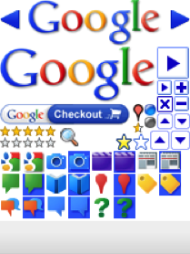
The search for a better performance is a continuous process. The Web went through several site construction architectures, and each one of them was looking for a more efficient standarization. Amongst these processes, we have the use of image sprites (Figure 19), whose concept it’s simple. Basically what it does is to join several small images and icons inside a single image, thus reducing the number of DNS requisitions, improving the performance and the user’s experience. (SUDA, 2013).
Figure 19- Image Sprite from Google.com
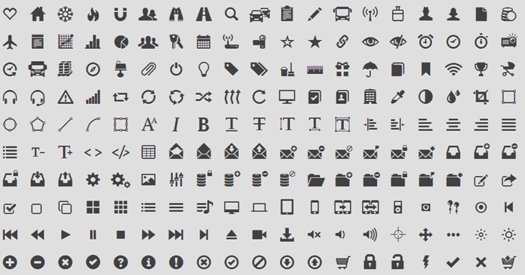
That sprite image concept is transported to Web Fonts. There are already specific Web Fonts (Figure 20) with symbols, icons and decorations and that number doesn’t stop growing. They have the same benefits – reduce file size, reduced requisitions, while also enjoying render power in high resolution – and substitute many images of the site with a simple font archive. (SUDA, 2013).
Figure 20 – Glyphicons typeface
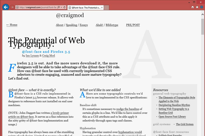
With accessibility in mind, the use of web fonts for symbols has to be planned and careful. Some fonts map the symbols using letters; for example when typing “E” would be renderized the figure from an envelope on the browser. Trouble can happen when sending the font fails (figures 21 and 22), resulting in rendering characters in random places, that do not make sense. So, it is necessary to recur to CSS to round those issues. One of the solutions given by Brian Suda (2013) is the use of correct direct text in HTML and the insertion of symbols by CSS’ pseudo-elements “:before” or “:after”. That way, if you wish to use an icon for a link that takes you to another page, the text of the link “next page” will be hidden, and the icon of an arrow will be presented via CSS. The author points that this problems could be solved if fonts followed Unicode’s correct patterns for those symbols. These special characters are not connected semantically with no letter of the alphabet. And if the font is not loaded, only an empty box will be displayed substituting the character instead of a letter.
Figure 21 – Page of the site @CRAIGMOD
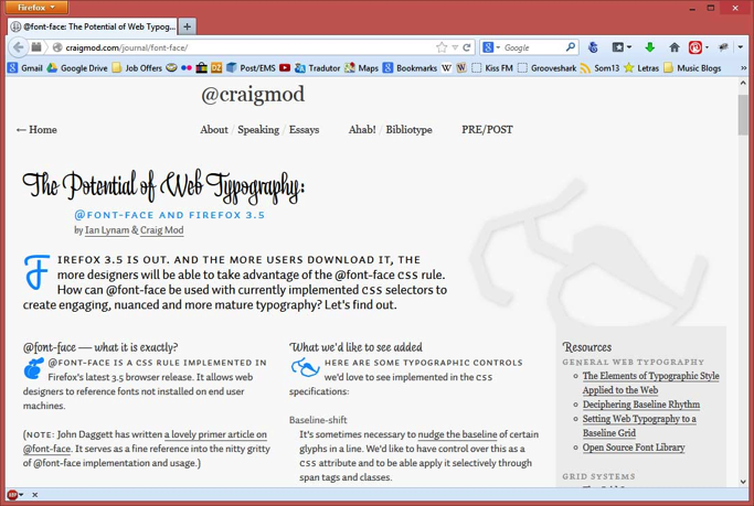
Figure 22 – Page of the site @CRAIGMOD
Ampliando ainda mais o uso dos ícones e símbolos em Web Fonts, Suda (2013) recorre ao uso das ligaturas OpenType, incentivando a ideia de que se pode fazer o uso de substituições da seguinte forma. Ao usar um texto com o seguinte dizer “A List Apart”, ele será convertido completamente para um único símbolo representando o logotipo do site A List Apart.
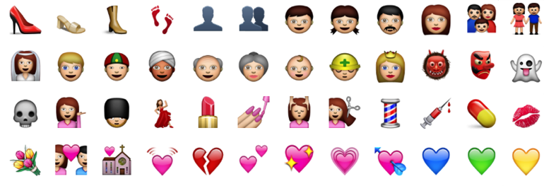
Apesar das vantagens de se usar uma fonte com ícones ou símbolos, elas possuem uma barreira ainda em estudo: as fontes somente aceitam uma única cor. Até é possível o uso de degradês, com algumas técnicas CSS para emular duas cores, mas, se necessário o uso de múltiplas cores, atualmente é preciso retornar ao uso dos sprites de imagens. Em vista de resolver essa situação, as empresas de sistemas operacionais começaram a propor soluções com fontes multicoloridas, por exemplo a Apple, que trouxe a fonte Apple Color Emoji (Figura 23). (SUDA, 2013).
Figure 23 – Apple Color Emoji Typeface
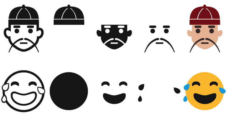
A solução proposta pela Apple e também pela Google utiliza um arquivo PNG para gerar o caractere e, com isso, consegue usar múltiplas cores. Já o Windows vem com uma proposta diferente (Figura 24), introduzindo o suporte de vetores em camada, sendo que cada camada recebe uma cor (Figura 25). (HERRMANN, 2013).
Figure 24 – Segoe UI Emoji Typeface
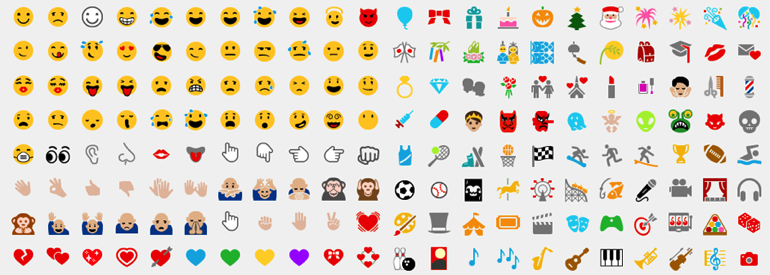
Figure 25 – Color scheme layered
Certamente as fontes de ícones e símbolos estão sendo fortemente impulsionadas e padronizadas com a expansão das Web Fonts devido à grande aceitação, sendo agora as fontes multicoloridas um novo avanço tipográfico que, embora já existente, ainda se encontra em estado de estudo, aguardando uma boa aceitação e padronização. Conforme Siegel (1999), os designers deveriam concentrar-se nas coisas que eles podem influenciar e esperar futuramente por melhores padrões, sendo as fontes multicoloridas apenas um exemplo de tecnologia a que esses profissionais devem se atentar. Sendo assim, designers precisam se manter atentos às tecnologias, a fim de poderem continuar impulsionando ainda mais o campo tipográfico e aprimorando seus conhecimentos.
5 ONGOING RESPONSIBILITY OF INTERFACE DESIGNERS IN THE CONTEXT OF WEB FONTS
Before the implementation of the rule “@font-face”, the use of external fonts was limited, without a widely-implemented technical solution. Today, with the use of this new rule, along with the expansion of Web Fonts, designers have been encouraged to evaluate their possibilities, in a scenario of convergence of the nuances of printed typography with the the dynamics of the Web. (LYNAM; MOD, 2009). Thus, it remains for the designers to understand those new advances and updates even more in a context as dynamic as the one of the Web which goes through constant modifications, always searching to obtain better standards and resources which take into account the needs of programmers and designers.
The arrival of the Web Fonts promises to get ride of any typographical monotony, till now dominated by the Web Safe Fonts, giving to the designer the possibility to select whatever font for his layout. (HERRMANN, 2011). However, such liberty requires careful selection and needs to be analyzed thoroughly. Um dos requisitos mais ignorados para uma seleção adequada ao projeto são os fatores histórico-culturais conectados ao tipo da fonte. Muitos estilos estão atrelados a períodos históricos, e é preciso saber em que momento essas fontes foram desenvolvidas, buscando conhecer o propósito para o qual foram feitas. Às vezes a fonte parece ser visualmente adequada, mas pode gerar uma má interpretação. Por exemplo, fontes góticas (Figura 26) são mais pesadas, escuras e afiadas, sendo mais adequadas quando se quer transmitir uma ideia de medo ou escuridão (Figura 27). Esse conhecimento usado de forma inteligente potencializa uma boa escolha e traz maior clareza ao usuário. (MARIA, 2009).
Figure 26 – Example of gothic typeface
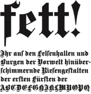
Figure 27 – Example of gothic arquitecture

Siegel (1999) said that “…uma boa tipografia deve procurar facilitar as coisas para o leitor, não desafiá-lo”. The author expresses the idea that the typography must be good. However a good usage of typography does not depend only on a good font, but a good choice. Para isso, o designer deve compreender o projeto como um todo, suas características, objetivos, suporte, aplicação, público-alvo, aspectos culturais e necessidades especiais. Uma boa seleção leva em conta a legibilidade, sendo que algumas fontes são mais legíveis em tela do que outras, e essa legibilidade é em parte influenciada pela altura-de-x (altura das letras minúsculas) e a altura total da fonte (LYNCH; HORTON. 2008), que por sua vez também sofrem influência direta dos recursos de renderização já mencionados anteriormente.
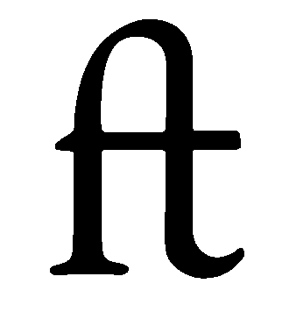
Após tais conceitos terem sido compreendidos e levados em consideração, e uma fonte ou família tipográfica adequada ter sido selecionada para o projeto, o designer passa a contar com os recursos OpenType avançados para a otimização tipográfica. Tais recursos propiciam ajustes mais apurados, com uma ampla gama de substituições automáticas e ajustes de espaçamento específicos para pares de letras. E por mais atuais que esses novos recursos possam parecer, é importante ressaltar que, no âmbito tipográfico, muitos deles já existiam e vêm sendo aprimorados desde os tipos móveis, sendo adaptados para o meio em que a tipografia se espalhou. Recursos como kerning, versaletes, letras caudais, ligaturas (Figura 28 e 29), etc, existentes já na tipografia digital, somente agora podem ser usados nativamente na Web sem nenhum recurso adicional. Portanto é responsabilidade do designer saber e utilizar regras que remontam do início da tipografia até hoje (BOULTON, 2005), regras estas extremamente úteis e aplicáveis no ambiente Web. Conforme Reichenstein (1996a), a tipografia é uma disciplina antiga que requer muito estudo e esforço repetitivo, e na prática ela não se resume a escolher ou criar fontes, mas se relaciona ao objetivo de modelar o texto para uma experiência de leitura ideal.
Figure 28 – Example of ligature “ft” of the typeface “Garamond” in movable metal type.
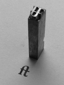
Figure 29 – Example of ligature “ft” of the digital typeface “Garamond”.
Optimizing typography is to improve readability, accessibility, and usability. Sua organização em blocos de texto e junção com imagens é o que os profissionais vêm aprimorando desde os primórdios tipográficos, portanto não devem ser negligenciados. Any designer can use a beautiful typeface, but good professionals treat the text as an important part of the interface, ensuring good read across the majority of browsers and platforms, the correct usage of line spacing, spacing between letters, breathing room and a good contrast, to help with good readability. Somente ter o trabalho de escolha de fonte para um projeto não é o suficiente, mas um bom uso tipográfico pode, inclusive, ser feito somente com uma única família. (REICHENSTEIN, 2006b). O uso de uma boa tipografia garante unidade gráfica, e a seleção de uma família confere consistência. Executando corretamente tais requisitos, não será necessário ter a certeza de que um site será exibido igual em várias plataformas e dispositivos, mas é necessário apurar sua facilidade de uso e de leitura. (REICHENSTEIN, 2006a).
Dominando tais conhecimentos em relação aos atuais recursos por parte do designer, é obrigação do mesmo compartilhar tais conhecimentos com desenvolvedores, atualmente ainda os responsáveis pela codificação dos layouts, aplicando corretamente tais recursos. Porém, essa responsabilidade pode voltar a se concentrar futuramente somente no designer com a melhora de programas capazes de codificar o layout.
6 CONCLUSION
The use of the typography as the basis of the written communication passed through a long road evolving to digital media. In the latter, their use extrapolated all that had been done, and inserted in the Web (initially with limited support, now with the expansion of Web Fonts) brought with it the prospect of visual enhancements with the release of the use of any typographical and family with features that enable advanced controls that influence in a better reading. As has been happening on the Web from the beginning, the way to stabilize Web Fonts is the standardization. Some discussions are still in force, as the form of your application and what format will be accepted by the W3C. With this standardization, all browsers will have to adapt, thus eliminating the current conflicts of formats. Before an official standardization, however, the picture is of an exponential expansion. Using Web Fonts is done by a large number of sites, and have already begun to see them expanding their potential, absorbing the sprites from images with symbol fonts and icons. This practice has spread in website development and is well accepted by the developer community.
The Web Fonts bring with features already implemented before in digital fonts for desktop and printing. The OpenType typographic features expand control and provide possibilities of using some unexplored by developers and interface designers. Keeping in mind that none of these technological resources are new in the typographic world, having their origins on the mobile types. Thus, currently, designers have the role of developers share with your prior typographic knowledge, so that together we can reach the objectified result in the production of the layout. With the possible expansion of programs that cut the layout, generating code, designers have a tool that can work without interference depend on the Developer as the codification of the layout, but such programs need to have implemented these new typographic features.
With the evolution of monitors and display screens as well as the high definition retina screen technology, the meticulous manual work to control hinting soon will no longer be necessary, giving the designer more liberty in the choice of font, thus bringing improvements in the rendering and, consequently, in the readability.
For the future, we already see signs of a new typographic expansion, given the still very limited for use and without a set, in a scenario where companies fight to create a format that is accepted by all format multicolored sources. As they arise tools that enable its creation, designers can give utilities hitherto unexplored.
Given such update, the designers have a responsibility to continue their improvement, not leaving behind his previous typographic knowledge, that, in the creation of interfaces, use typography as an ally, integrating it to the interface, giving more clarity in communication with the user. Its interface must meet the current devices and screens such as Smart TVs, but also be prepared for new devices such as SmartWatchs, browsers and not as common as the one in the consoles Xbox, Playstation, etc.
REFERENCES
- ADOBE SYSTEMS INCORPORATED. Color Fonts. Available in: <https://color.typekit.com/>. Access: November 20, 2016.
- AHRENS, Tim. A closer look at TrueType hinting. Dec. 14, 2010. Available in: <http://blog.typekit.com/2010/12/14/a-closer-look-at-truetype-hinting/>. Access: November 24, 2013.
- AMPSOFT. Common fonts to all versions of Windows & Mac equivalents. Jun. 03, 2008. Available in: <http://www.ampsoft.net/webdesign-l/WindowsMacFonts.html>. Access: May 04, 2014.
- BOULTON, Mark. Five simple steps to better typography. Apr. 13, 2005. Available in: <http://www.markboulton.co.uk/journal/five-simple-steps-to-better-typography>. Access: March 31, 2014.
- BRINGHURST, Robert. Elementos do Estilo Tipográfico (versão 3.0). Tradução André Stolarski. São Paulo: Cosac Naify, 2005. 428p.
- COSTELLO, Daria. Typography in the 21st Century. Feb. 21, 2019. Available in:<https://dopasolution.com/typography/>. Access: February 27, 2020.
- DAGGETT, John. Beautiful fonts with @font-face. Jun. 11, 2009. Available in: <https://hacks.mozilla.org/2009/06/beautiful-fonts-with-font-face/>. Access: November 23, 2013.
- FARIAS, Priscila L. Tipografia digital: o impacto das novas tecnologias. 4ª ed. Rio de Janeiro: 2AB, 2013. 160p.
- FERREIRA, Gustavo. Notas sobre webfonts. Oct. 2011. Available in: <http://hipertipo.com/content/notas-sobre-webfonts>. Access: December 05, 2013.
- FINK, Richard. Web Fonts at the Crossing. Jun. 08, 2010. Available in: <http://alistapart.com/article/fonts-at-the-crossing>. Access : November 24, 2013.
- FONTSHOP INTERNATIONAL. Fontfont Opentype® User Guide. Abr. 2012. Available in: <https://www.fontfont.com/staticcontent/downloads/FF_OT_User_Guide.pdf>. Access: May 06, 2014.
- GIANNATTASIO, Tom. The Ails Of Typographic Anti-Aliasing. Nov. 02, 2009. Available in: <http://www.smashingmagazine.com/2009/11/02/the-ails-of-typographic-anti-aliasing/>. Access: March 29, 2014.
- GLYPHICONS. Library of precisely prepared monochromatic icons and symbols. Available in: <http://glyphicons.com/>. Access: May 04, 2014.
- [GOOGLE’S IMAGES SPRITE]. Available in: <http://www.google.com/images/srpr/nav_logo14.png>. Access: May 04, 2014.
- GREGUREC, Ivo. Tutorial: How To Create A Custom Icon Webfont. Available in: <https://www.toptal.com/designers/icon/custom-icon-webfont-tutorial>. Access: September 08, 2017.
- GRIGORIK, Ilya. Web Fonts Performance: Making Pretty, Fast. Sep. 12, 2012. Available in: <http://www.igvita.com/2012/09/12/web-fonts-performance-making-pretty-fast/>. Access: November 23, 2013.
- HERRMANN, Ralf. Better web typography with OpenType features. Aug. 14, 2010. Available in: <http://opentype.info/blog/2010/08/14/better-web-typography-with-opentype-features/>. Access: April 20, 2014.
- HERRMANN, Ralf. Color Emoji in Windows 8.1—The Future of Color Fonts?. Jul. 03, 2013. Available in: <http://opentype.info/blog/2013/07/03/color-emoji-in-windows-8-1-the-future-of-color-fonts/>. Access: March 29, 2014.
- HERRMANN, Ralf. The @Font-Face Rule And Useful Web Font Tricks.02 mar. 2011. Available in: <http://www.smashingmagazine.com/2011/03/02/the-font-face-rule-revisited-and-useful-tricks/>. Access: November 24, 2013.
- HTTP ARCHIVE. Desenvolvido por WebPagetest. Sites withCustomFonts. Available in: <http://httparchive.org/trends.php?s=All&minlabel=Nov+15+2010&maxlabel=Nov+15+2013#perFonts>. Access: November 26, 2013.
- LILLEY, Chris. WebFonts: level up! – BrazilJS Conf 2016. Sep. 26, 2016. Available in: <https://www.youtube.com/watch?v=ShQsIE1gI3w/>. Access: February 08, 2017.
- LYNAM , Ian; MOD, Craig. The Potential of Web Typography: @font-face and Firefox 3.5. 2009. Available in: <http://craigmod.com/journal/font-face/>. Access: November 23, 2013.
- LYNCH, Patrick J.; HORTON, Sarah. 2008. Web Style Guide 3rd edition. Available in: <http://www.webstyleguide.com/wsg3/8-typography/index.html> Access: April 26, 2014.
- LUPTON, Ellen. Pensar Com Tipos: Guia para Designers, Escritores, Editores e Estudantes. Tradução André Stolarski. São Paulo: Cosac Naify, 2006. 184p.
- MAAG, Dalton. Portfolio Ubuntu. Available in: <https://www.daltonmaag.com/portfolio/all/ubuntu.html>. Acess May 03, 2014.
- MANIAN, Divya. Font in your face. Jul.25, 2009. Available in: <http://nimbupani.com/font-in-your-face.html>. Access: December 08, 2013.
- MARIA, Jason Santa. On Web Typography. Nov. 17, 2009. Available in: <http://alistapart.com/article/on-web-typography>. Access: November 24, 2013.
- MENING, Robert. 15 Best Web Safe Fonts – That Work With HTML & CSS. 2017. Available in: <https://websitesetup.org/web-safe-fonts-html-css>. Access: April 30, 2017.
- MICO. How to suppress a “Rare” ligature that pre-empts a “Common” ligature for the same character pair?. Jan. 09, 2013. Available in: <http://tex.stackexchange.com/questions/89963/how-to-suppress-a-rare-ligature-that-pre-empts-a-common-ligature-for-the-sam>. Access: May 17, 2014.
- MICROSOFT. TrueType core fonts for the Web FAQ. Jul. 25, 2002. Available in: <http://www.microsoft.com/typography/faq/faq8.htm>. Access: April 18, 2014.
- REICHENSTEIN , Oliver. Reactions to 95% Typography. Nov. 04, 2006. Available in: <http://ia.net/blog/webdesign-is-95-typography-partii>. Access: April 18, 2014.
- REICHENSTEIN, Oliver. Web Design is 95% Typography. Oct. 19, 2006. Available in: <http://ia.net/blog/the-web-is-all-about-typography-period>. Access: January 29, 2014.
- REYNOLDS, Dan. The Library of the Gutenberg Museum. Mar. 01, 2010. Available in: <http://ilovetypography.com/2010/03/01/the-library-of-the-gutenberg-museum/>. Access: May 18, 2014.
- ROCHA, Claudio. Projeto Tipográfico: Análise e Produção de fontes digitais. 3ª ed. São Paulo: Edições Rosari, 2005. 170p. (Coleção textodesign).
- ROCHELEAU, Jake. Intro to Variable Fonts in Web Design. Oct. 05, 2016. Available in: <https://designmodo.com/variable-fonts/>. Access: November 20, 2016.
- SEREN. Death to Icon Fonts. Jun. 29, 2015. Available in: <http://speakerdeck.com/ninjanails/death-to-icon-fonts>. Access: April 03, 2016.
- SHEKEY, Aaron. Delivering Octicons with SVG. Feb. 22, 2016. Available in: <https://github.com/blog/2112-delivering-octicons-with-svg>. Access: April 03, 2016.
- SHERMAN, Nick. Font Hinting and the Future of Responsive Typography. Feb. 22, 2013. Available in: <http://alistapart.com/column/font-hinting-and-the-future-of-responsive-typography>. Access: March 25, 2014.
- SIEGEL. David. Criando Sites Arrasadores Na Web III: A Arte da Terceira Geração em Design de Sites. Tradução Equipe Market Book. São Paulo: Market Books, 1999. 344p.
- SIVYER , Jack. Gothic Architecture two. 2011. Available in: <http://jacklovesallys.deviantart.com/art/Gothic-Architecture-two-216557547>. Access: May 18, 2014.
- STEARNS, Alan. Say No to Faux Bold. May 08, 2012. Available in: <http://alistapart.com/article/say-no-to-faux-bold>. Access: March 16, 2014.
- STEIN, Bram. Kerning on the Web. Feb. 05, 2014. Available in: <http://blog.typekit.com/2014/02/05/kerning-on-the-web/>. Access: May 06, 2014.
- SUDA, Brian. The Era of Symbol Fonts. Mar. 12, 2013. Available in:<http://alistapart.com/article/the-era-of-symbol-fonts>. Access: March 23, 2014.
- VEEN, Greg. Introduction to web typography and @font-face. Oct. 10, 2011. Available in: <http://www.adobe.com/devnet/html5/articles/web-typography-and-css-font-face.html>. Access: November 24, 2013.
- WORLD WIDE WEB CONSORTIUM. CSS Fonts Module Level 3. Feb. 26, 2014. Available in: <http://dev.w3.org/csswg/css-fonts-3/>. Access: April 20, 2014.
- ULLRICH, Daniel. ft-ligature type in 12p Garamond. 2006. Available in: <http://commons.wikimedia.org/wiki/File:Garamond_type_ft-ligature.jpg>. Access: May 17, 2014.
- UNICODE. History of Unicode. Available in: <http://www.unicode.org/history/summary.html>. Access: April 19, 2014.